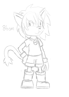
Here's the original concept for Biscuit's design, made to showcase to the team what kind of character we were looking for, using art styles such as those in Star Fox for reference.

Once it was clear we would be working with a bipedal cat character, the design process changed to experimentation with a number of different cat breeds in an attempt to push what we could do with the design, as well as what kind of character we wanted for our protagonist. From there the team could find an aesthetic for Biscuit's future designs to follow.
From producing drawings like these, the team decided that Biscuit would be a cat like the tabby in the top right drawing, as the cuteness of the design would be more appealing to our target audience. Experimentation with proportions began, as the original drawing for the character wasn't polished enough in that regard.
A more final concept for Biscuit's design was created.

However, it was at this point that the game idea changed completely, requiring the team to revisit the style of the game and redesign Biscuit to match. The resulting drawings varied between more humanised cats and more cartoony characters, befitting titles such as Sonic the Hedgehog.
The team decided that the cartoonier style would be more appropriate. After tweaking Biscuit's proportions to make her shorter, the team decided that this would be final design to colour, also deciding on her height so that the rest of the game could be scaled with it in mind.
A mock-up of a colour reference was created, using oranges and blues for contrast. Orange was used as it seemed a more colourful choice than the greys of Biscuit's older design, matching the colourful cartoon environment the game would now take place in.
With some small tweaks, reference material for Biscuit's final design was made.


No comments:
Post a Comment